top of page


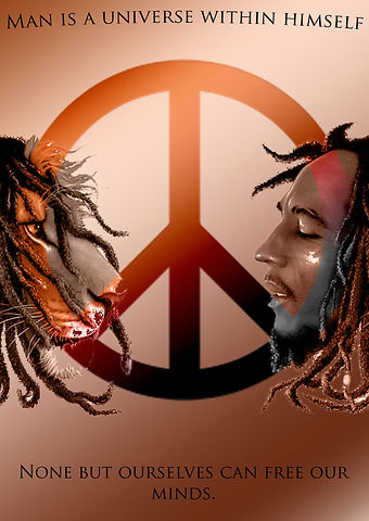
Before and after of my poster

After handing in my first poster (on the right) I received loads of feedback saying what i could change. The only thing i kept was the Lion and Bob Marley. i kept this image because I like the way the two images are merged together to make one.
out of both of my posters. I prefer my more improved poster (on the left). I think this because of the colour scheme and the other images i used.
Before
After
Here are some posters from the class
bottom of page